
-Red Earth Cooperative-
Campaign & Promotion | Fall 2012
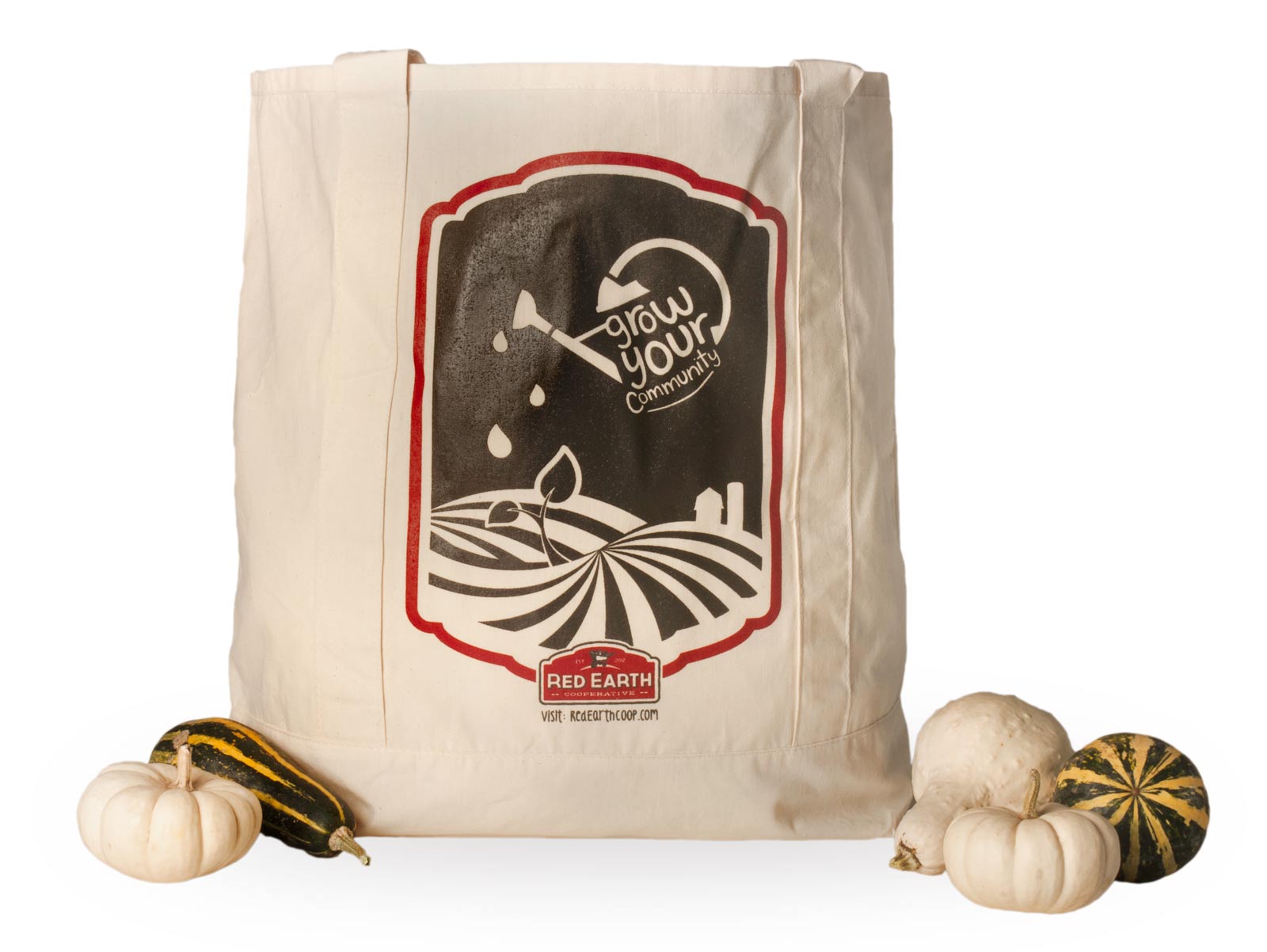
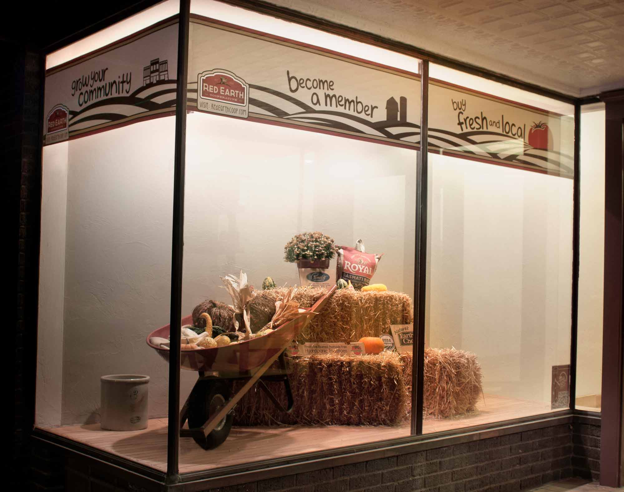
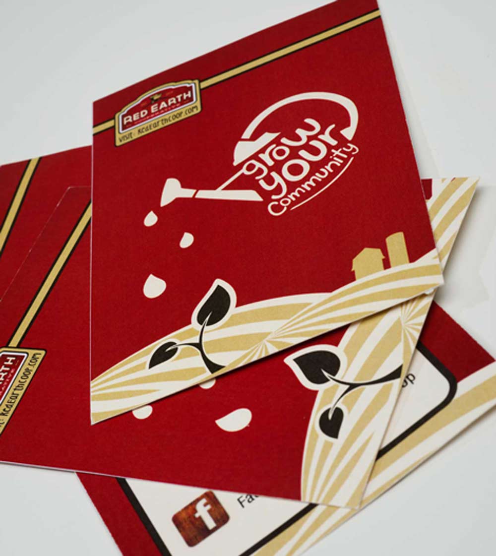
Grow Your Community
This campaign was developed in cooperation with the Red Earth Cooperative. The cooperative is in the process as establishing itself in the community. My campaign focused on helping the coop get community attention by developing an event where community members could pick up informational postcards, promotional magnets, and if they signed up they would receive a screen printed tote bag. I also assisted in creating a window display for their store front.
-Close Project-
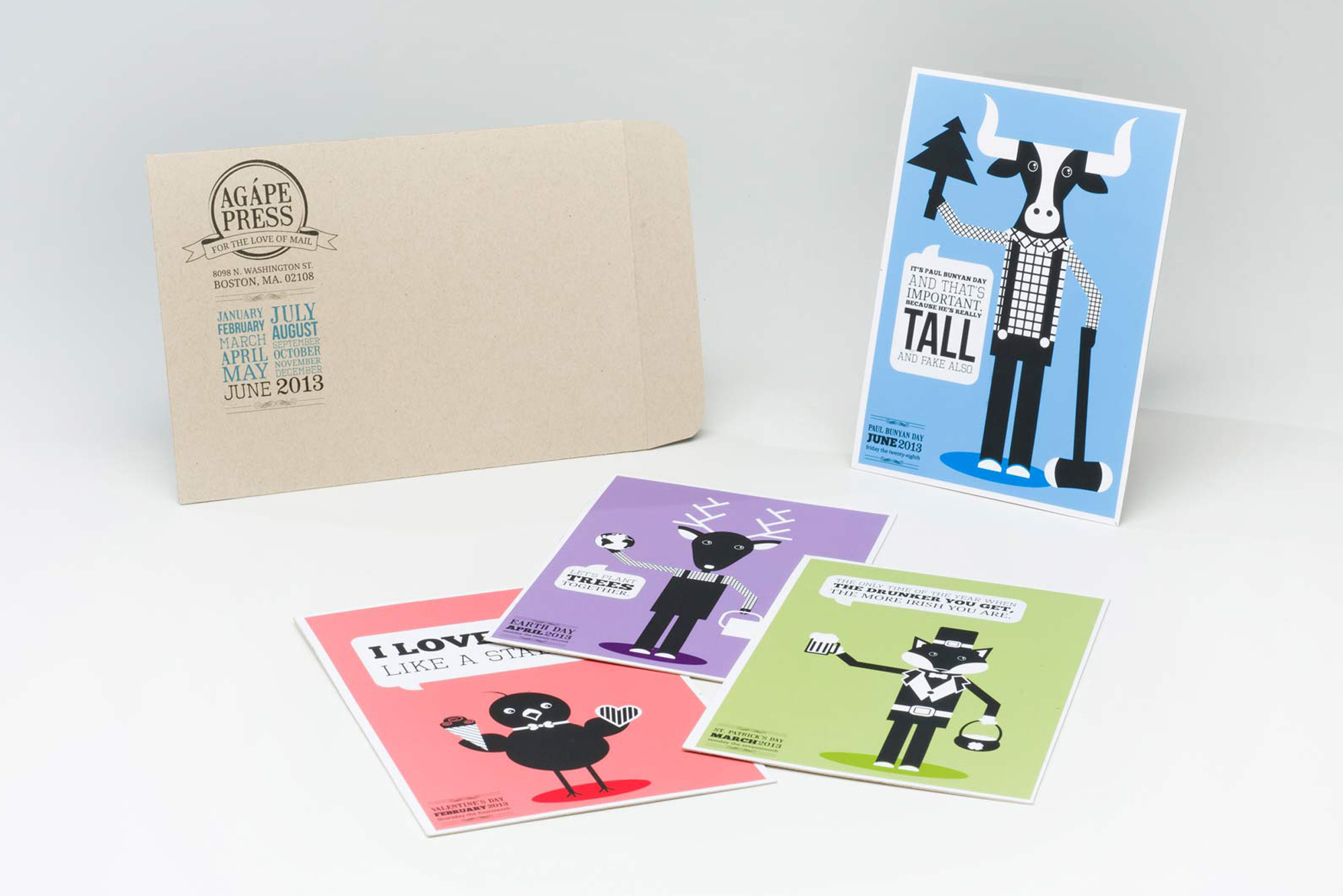
-Agápe Press-
Direct Mail & Illustration | Fall 2012
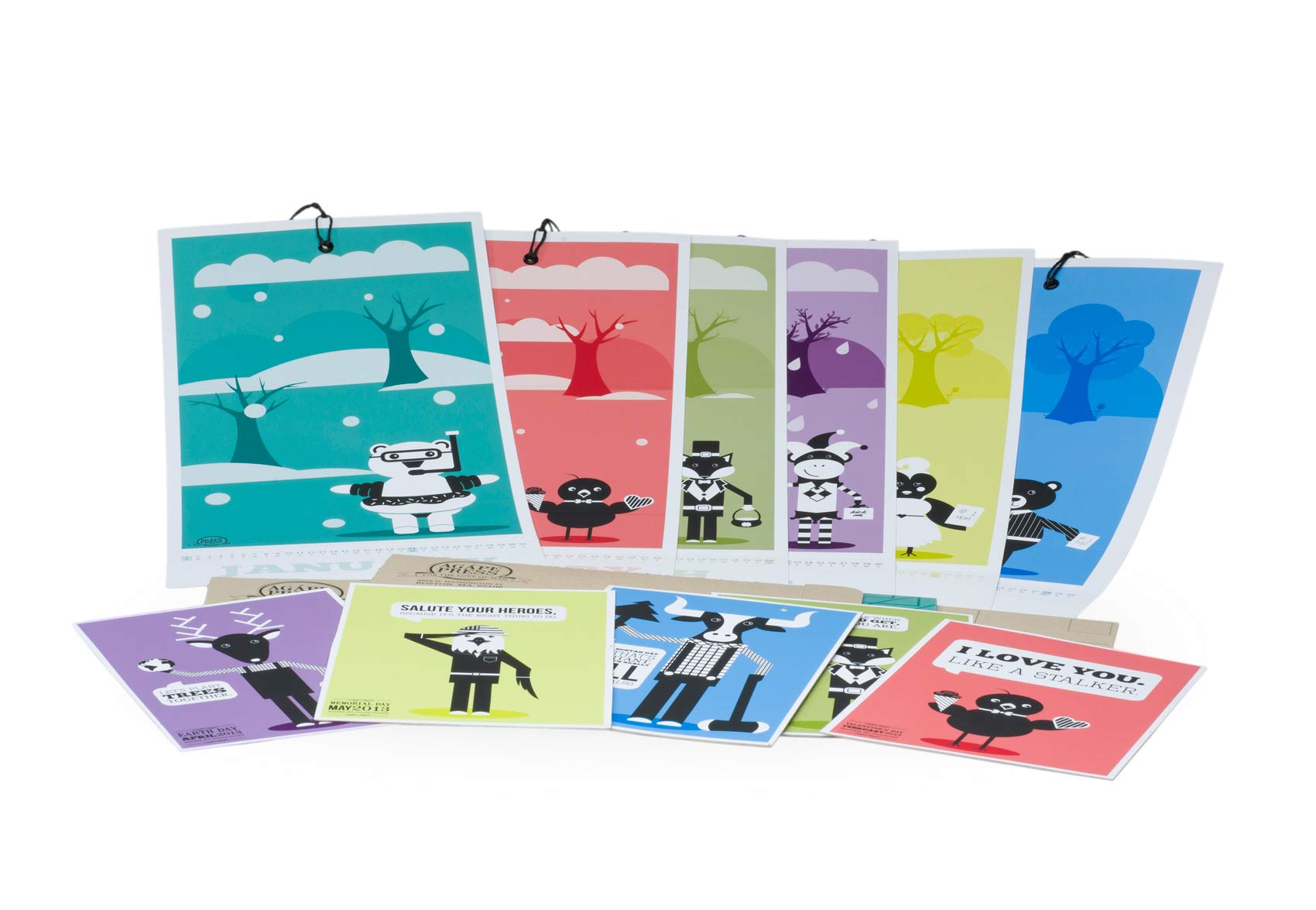
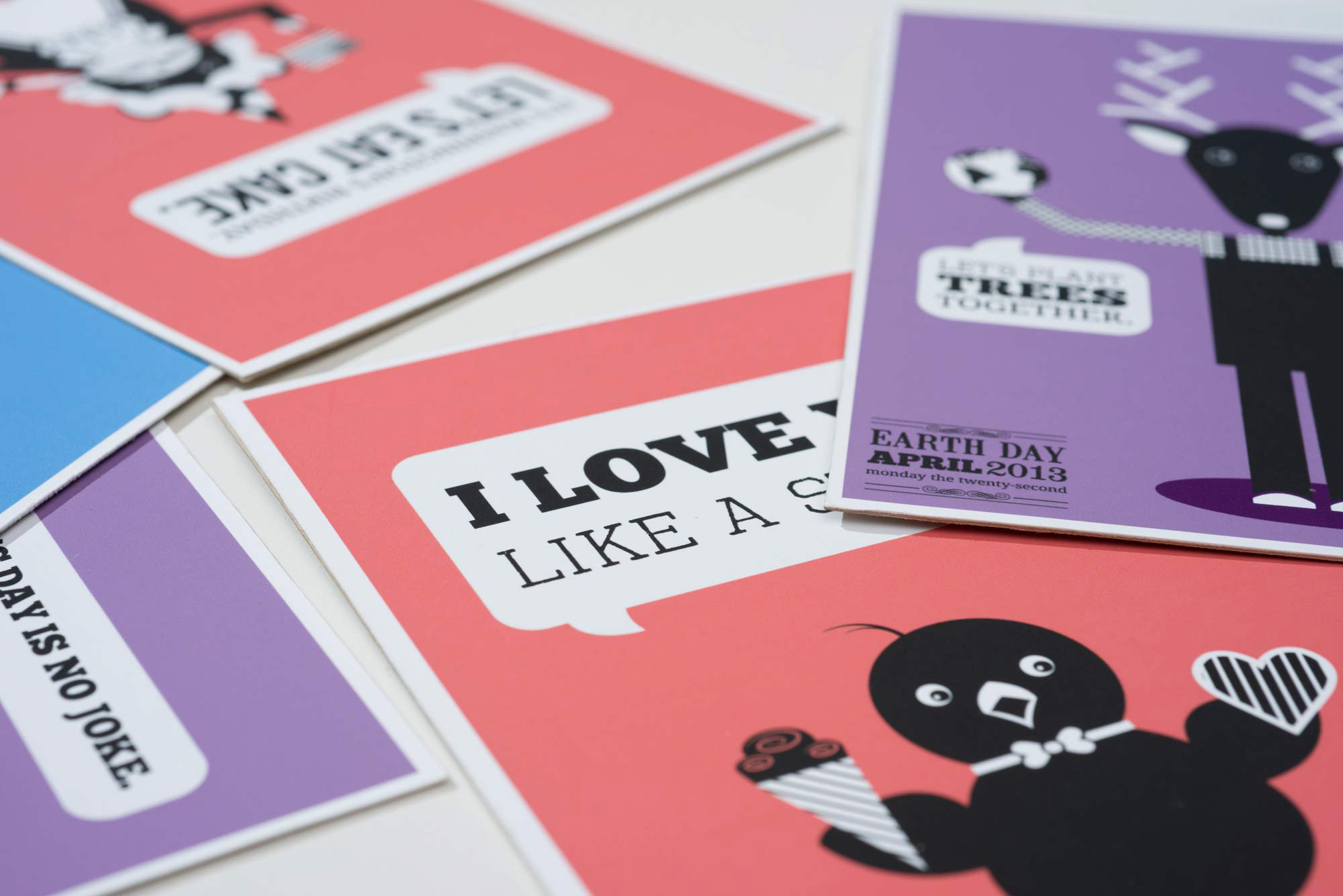
Agápe Love
"Agápe" means "love" in Greek. This is a fun and quirky project created with the intent to involve people in social interaction. This project is an illustration series I have created that examines our cultural perceptions of holidays. The series primarily uses humor to create more interaction between the viewer and the character. I have began this series by researching two holidays per month. I examined the message each holiday conveys, as well as, how the holiday was celebrated. This informed which character I chose for which holiday as well as the character's attire and any objects the character might be holding. Each color in these designs have been chosen carefully to correspond with the environment that you might see surrounding you during the month that the holiday occurs in. This project has continued to expand in many ways, from social media to screen printing. The design inspiration is based on late 19th century print media.
-Close Project-
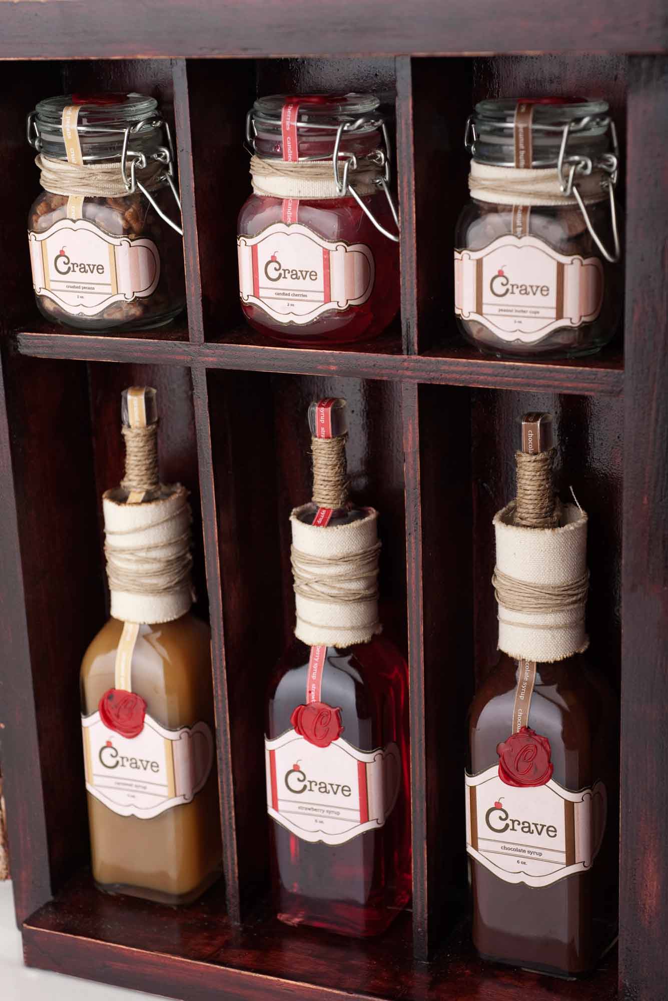
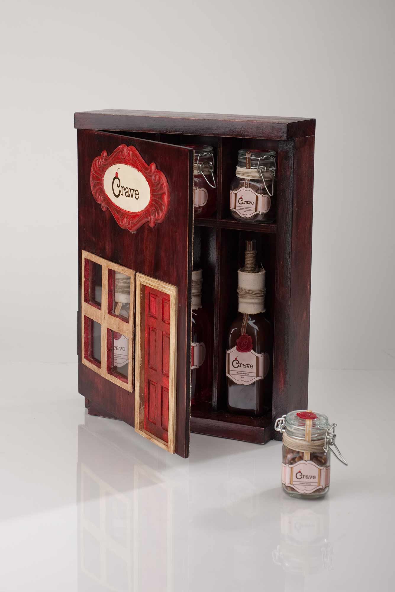
-Crave-
Identity & Package Design | Fall 2011
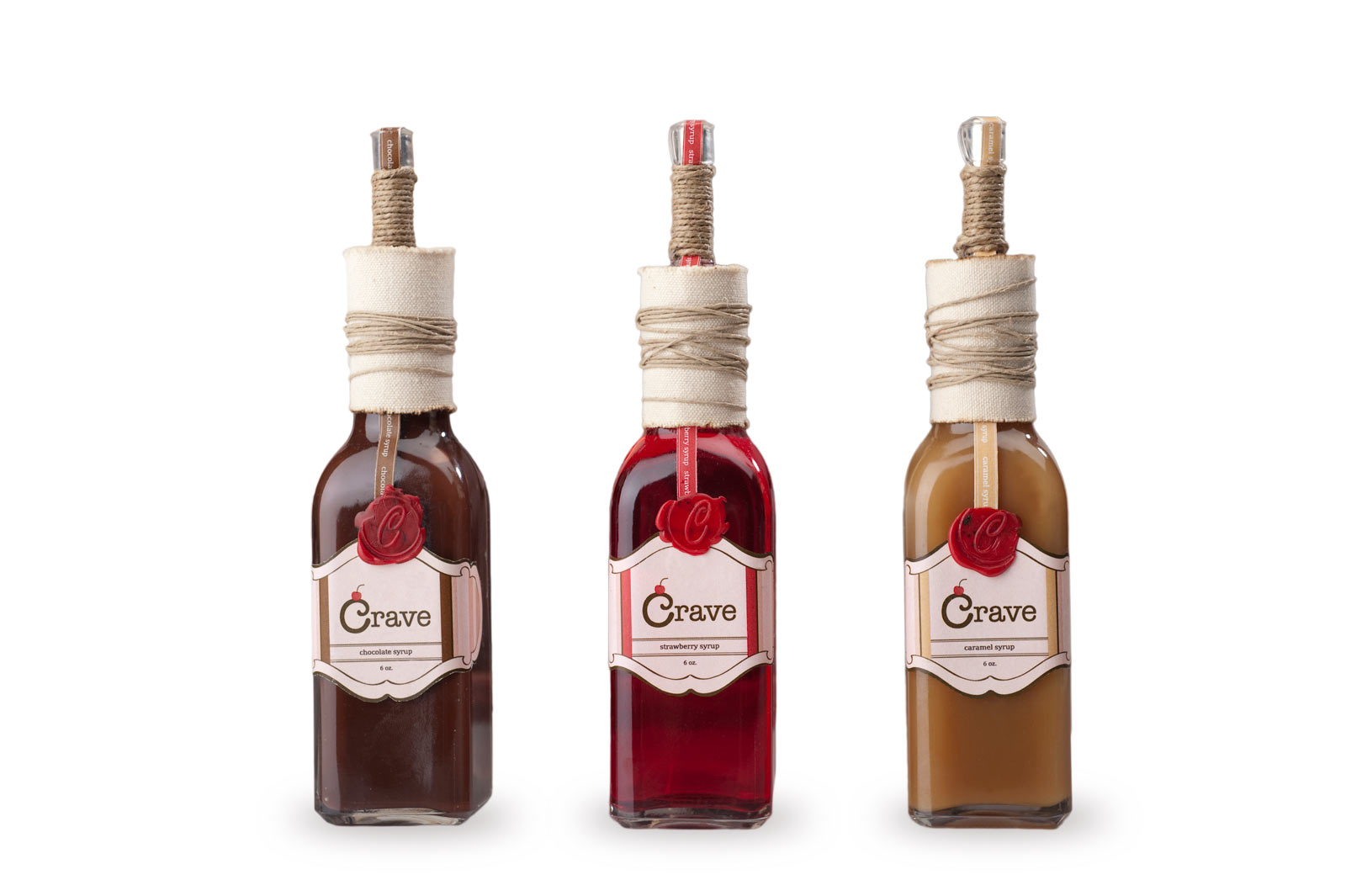
Crave Dessert Toppings
This novelty product was created to have a feeling of decadence and luxury. This was accomplished through tactile textures used in the package, such as, raw canvas and wax seals. The labels and package were inspired by 1950's ice cream parlors. The pacakge was designed to fit underneath standar cupboards making it a convenient addition to anyone's kitchen counter. This product would appeal to adults, between the ages of 30-40, that enjoy entertaining.
-Close Project-
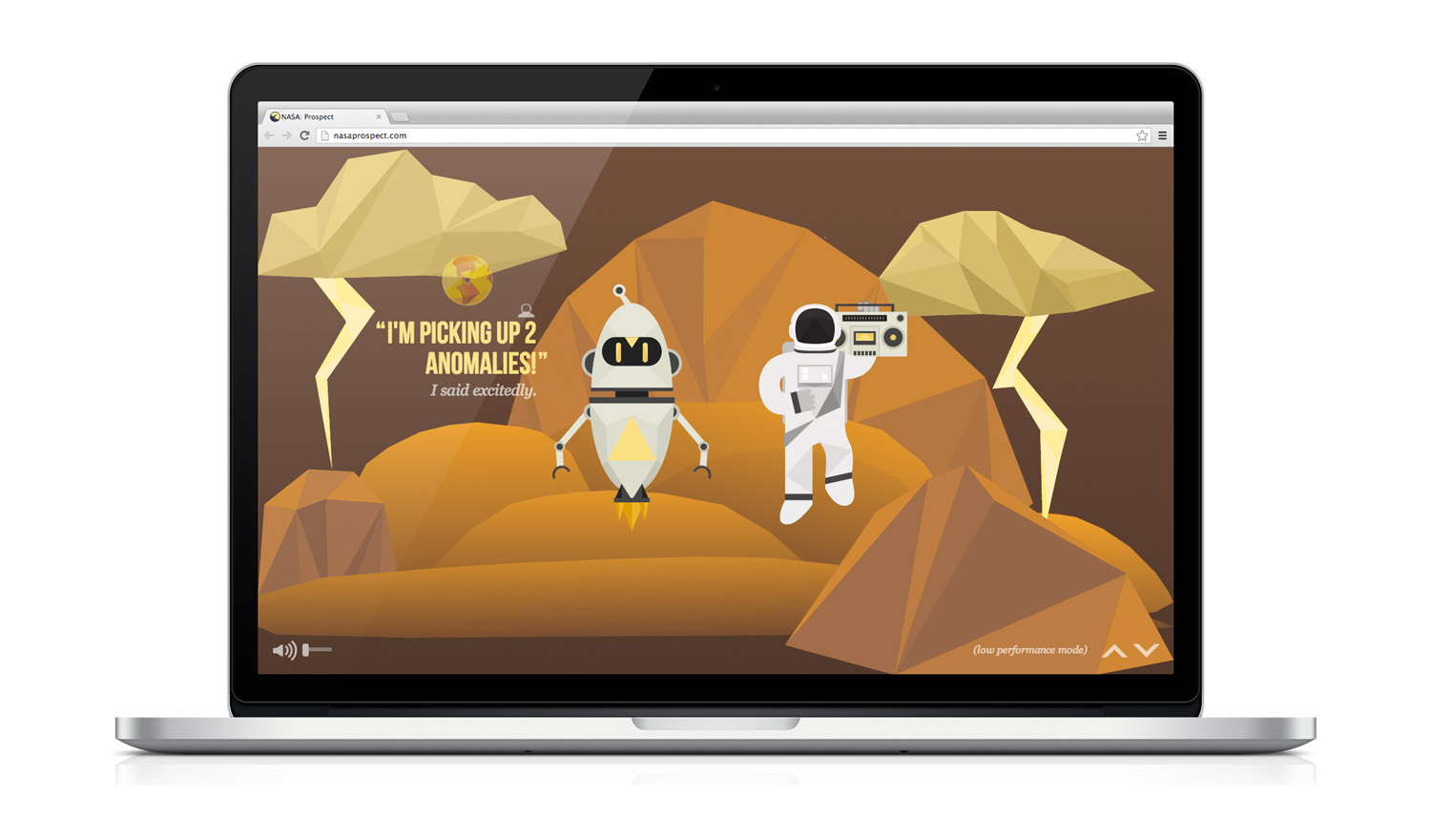
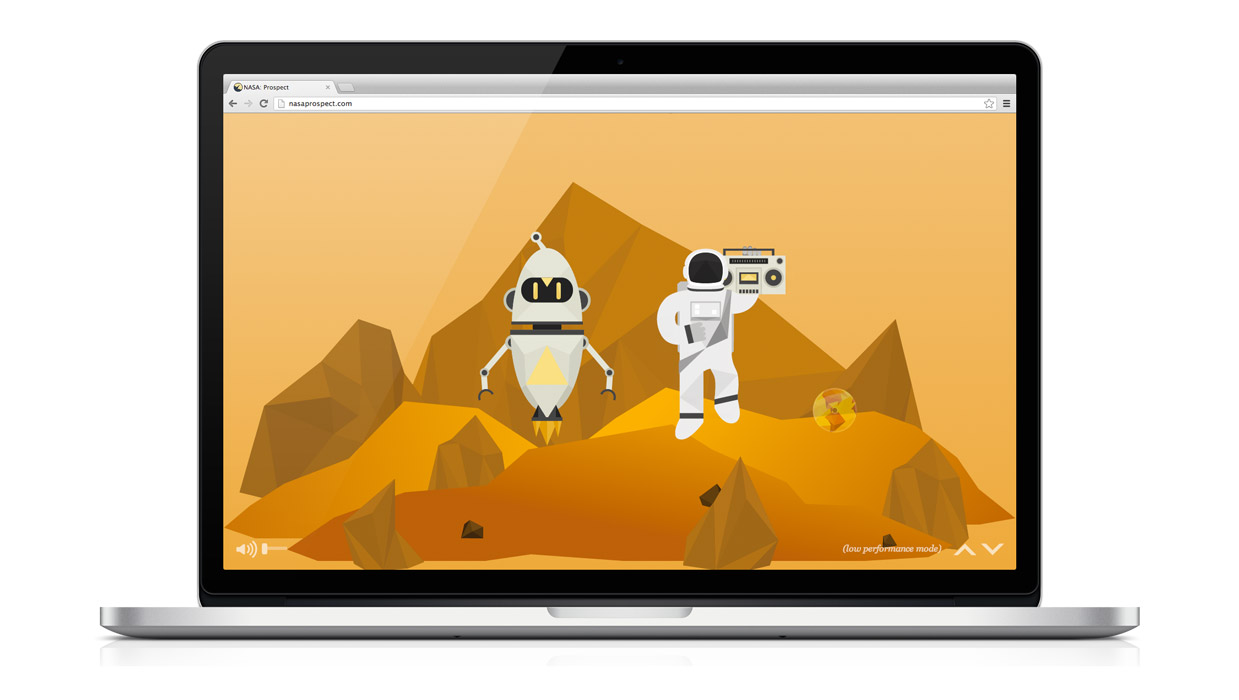
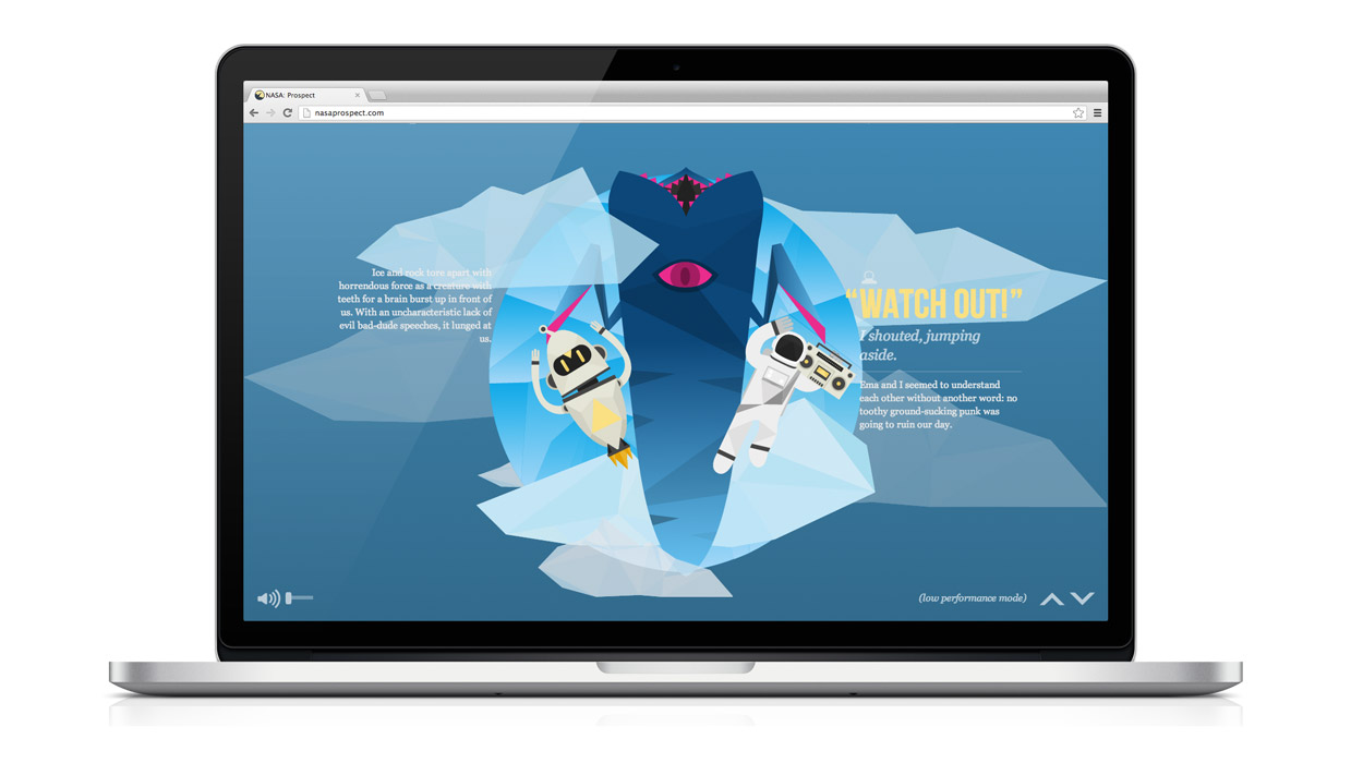
NASA Prospect
Illustration & Web Design
This was a class project to create a website that was strongly illustrative while promoting accountability among peers. The project was part of a pilot study of NASA's Humans in Space Art Undergraduate Challenge. The target audience is children in the grades 4-6.
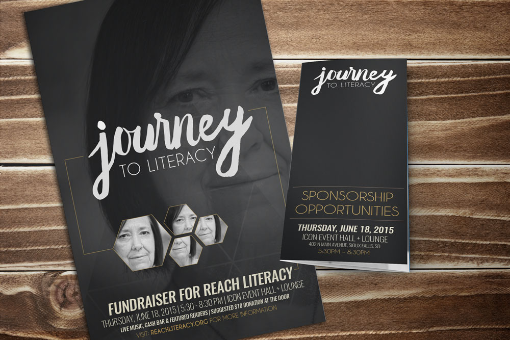
Journey to Literacy
Identity & Promotional Materials
The goal of this project is to create awareness for a local, Sioux Falls non-profit that provides literacy education to adult learners. I personally worked with the non-profit to developed the brand for an annual fundraising event to reach the target market. Established visual language and executed throughout all promotional materials.
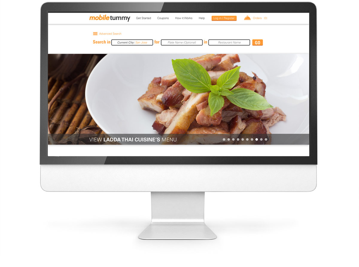
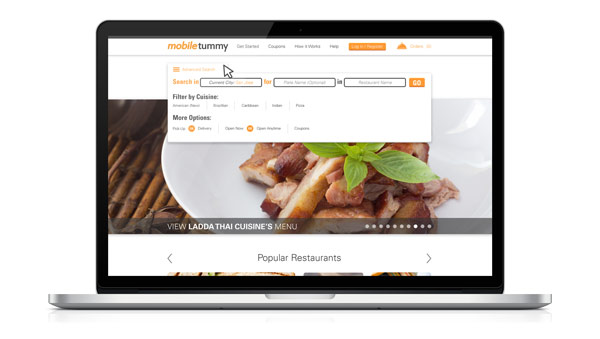
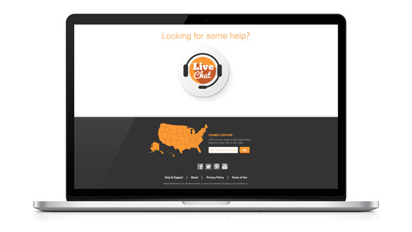
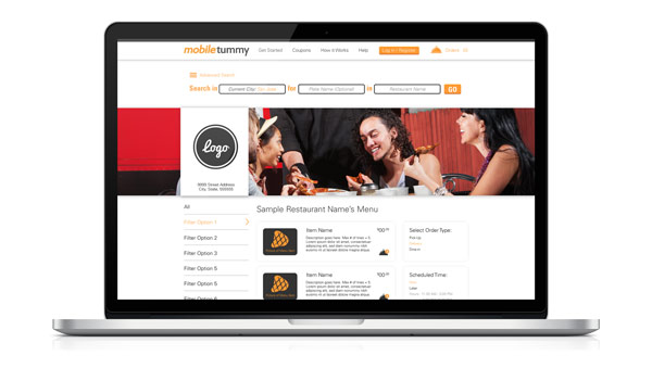
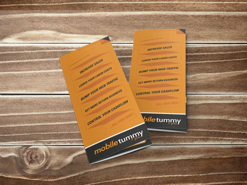
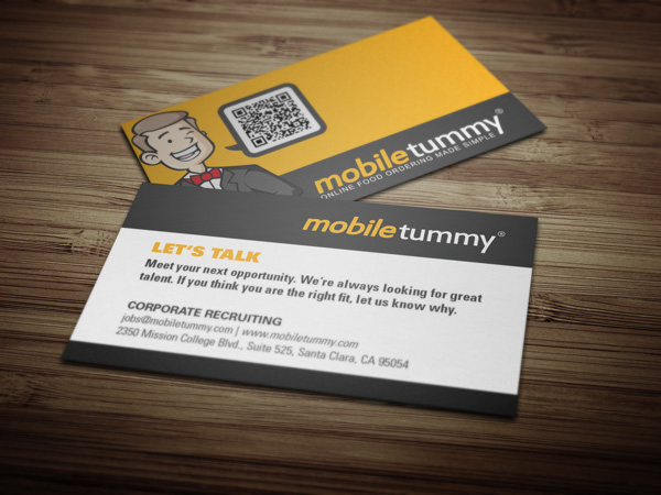
Mobiletummy
Branding & Marketing Materials
For this client, I consulted and managed an entire rebrand of their company, working directly with the Director of Marketing. I was able to carry through elements that had strong brand equity to maintain the brand's current audience, while still attracting new customers with an updated and modern identity. The goal of the brand was to provide a clean and friendly brand that people could feel that they could trust in.

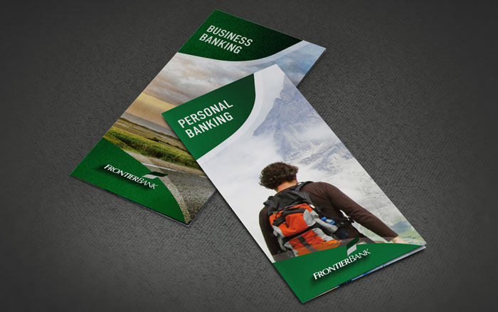
Frontier Bank
Brochure Design
This project included a redesign and compilation of several existing brochures into two brochures.The brochures have a fresh new look that provides a professional friendliness to bank customers.
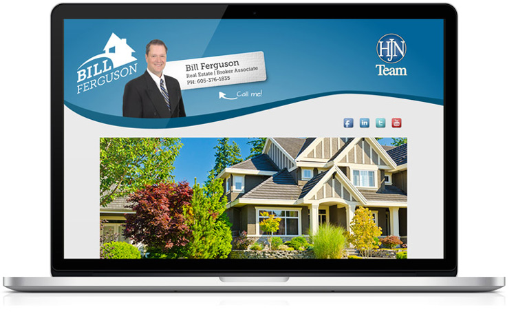
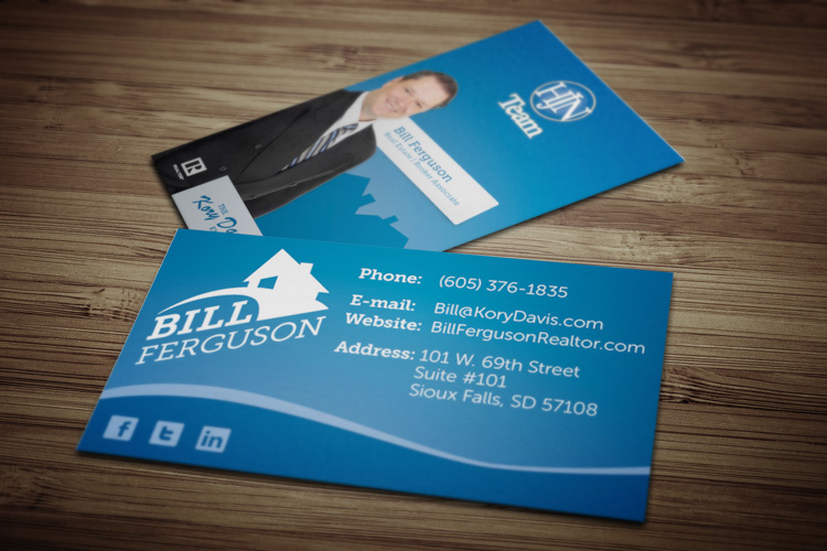
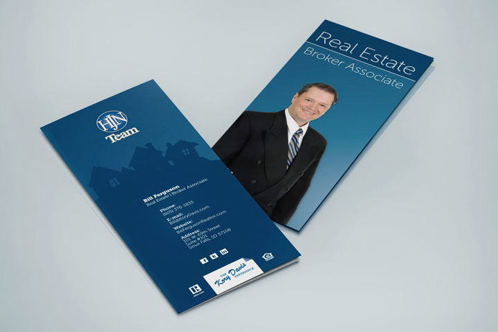
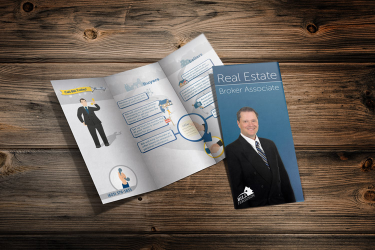
Bill Ferguson
Identity & Promotional Materials
The goal for this client was to create a friendly and inviting brand that conveys trust to the audience. The use of the illustrated homes creates that "warm, fuzzy" feeling for the potential home buyers and sellers so they feel at ease.
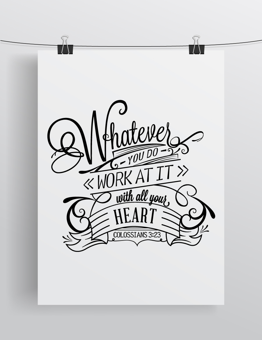
Click Rain
Typography Poster
This was a typography poster I had the chance to create for Click Rain, while employed there. The verse was chosen by leadership as their guiding verse for the company. The piece was created in and executed in black and white to emphasize the beauty found in the simplicity of letterforms.
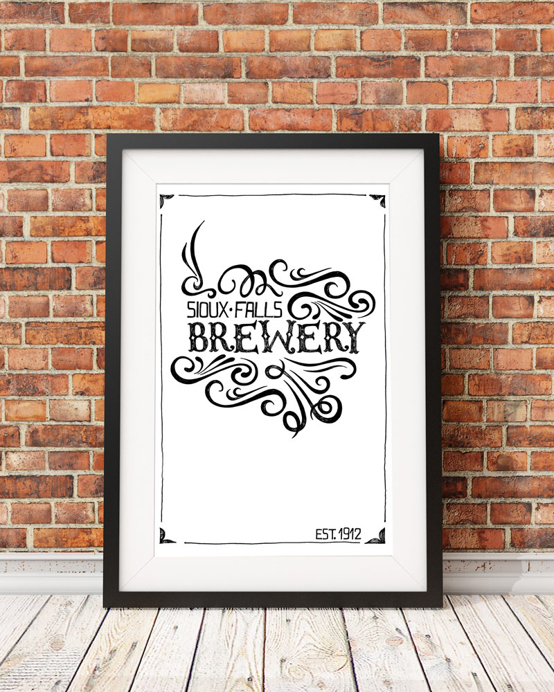
"Design Sioux Falls" Art Show
Typography Poster
This poster was completed for a Sioux Falls art show, entitled "Design Sioux Falls" at Exposure Galleries, featuring various local graphic artists. The Sioux Falls Brewery was a historic company started prior to prohibition, with building having since burned down. The typography and texture is a reference to the early 1900's style of printing.
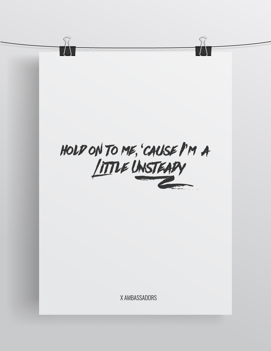
XAmbassadors Lyric Poster
Typography Poster
This poster was completed as a part of a personal project I have started working on. I am a music-lover, having no musical talent, who decided to merge two of passions into one project. The project was created with the idea of putting large emphasis on pieces of a song I find to have powerful lyrics.
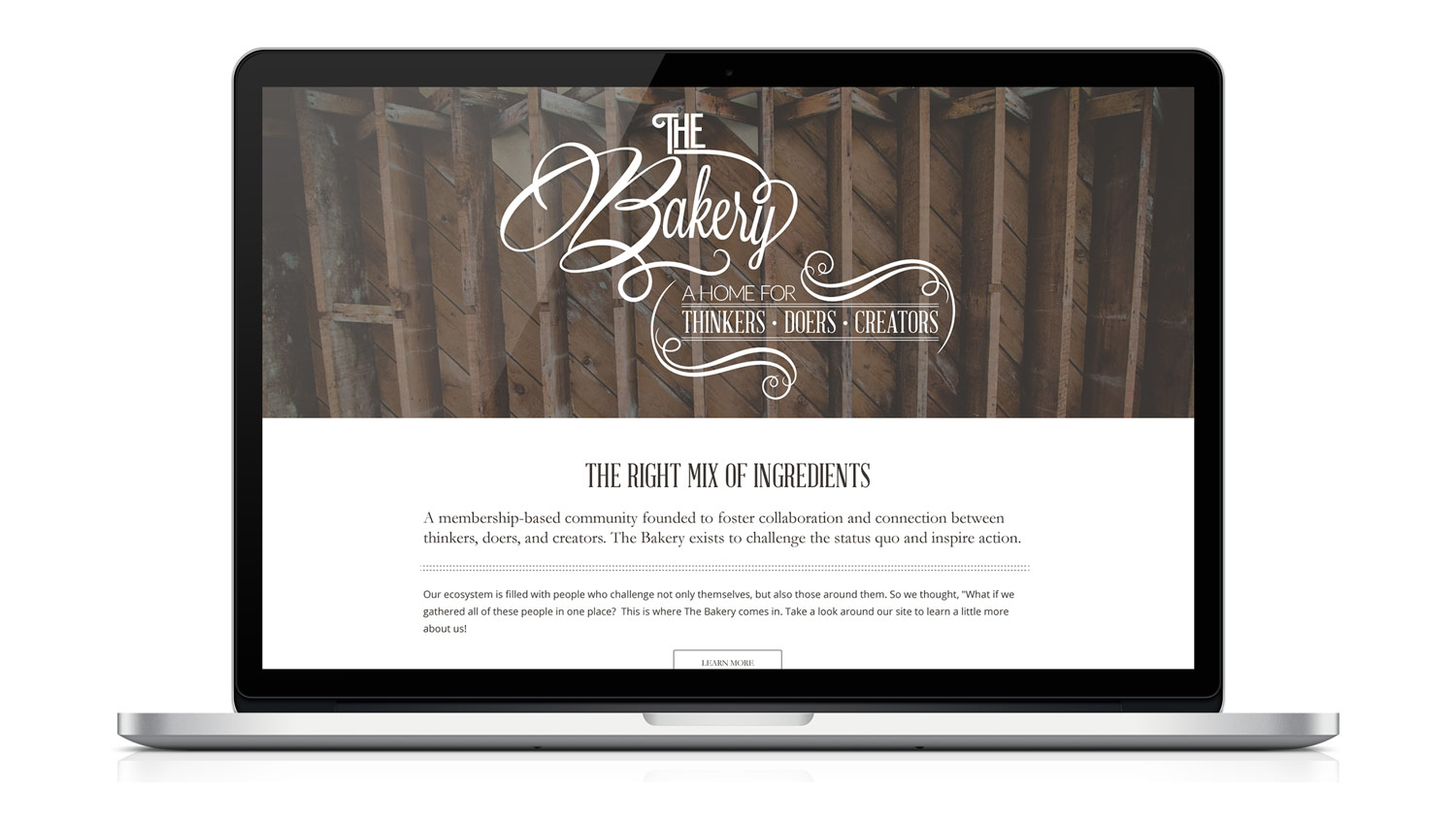
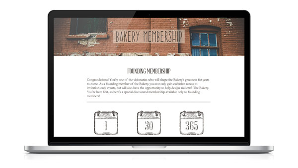
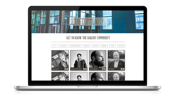
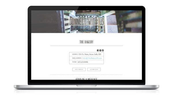
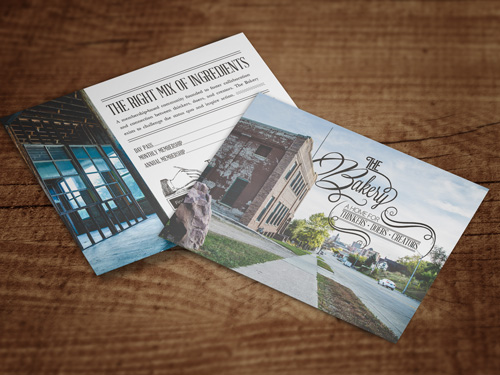
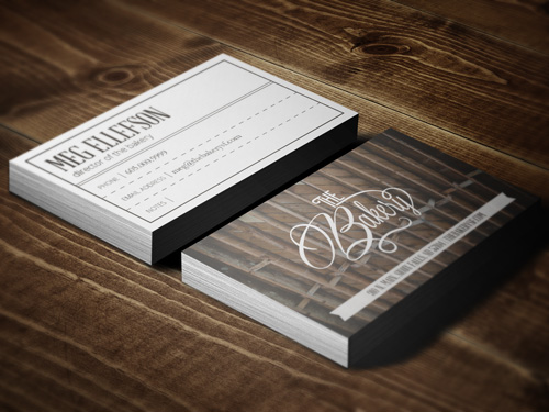
The Bakery
Branding & Web Design
An innovative collaborative space, this project provided an opportunity for me to brand what was just an idea when I undertook it. I was able to help contribute to the formation of what was an idea into a physical manifestation of a new way to approach co-working. This brand was created with two things in mind: 1) The Bakery is a community space and should have some reflection of ”comfort” and ”warmth” to represent The Bakery's commitment to service, and 2) The brand should reflect the history of the physical space that The Bakery occupies. The building was built in the early 1900's during the age of hand-painted signs and broadsides. The brand draws upon the aesthetics of these two things coupled with Art Nouveau, an art movement that was prominent up until 1920, until the movement was displaced by Art Deco.

Girard's
Branding & Identity
This is a branding project for a small start up salsa company. The goal of this company was to create affordable luxury. They wanted to sell a product that was attainable for all budgets, yet provide a product that was a healthier and more natural option. This is reflected in the logo's traditional simplicity.
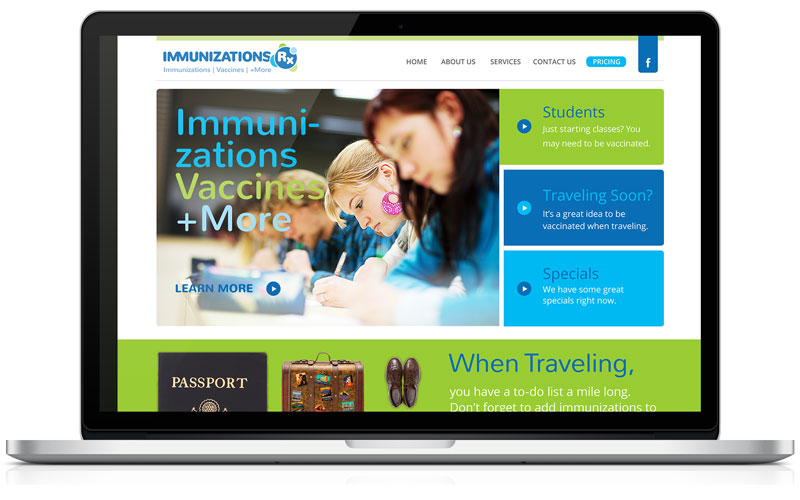
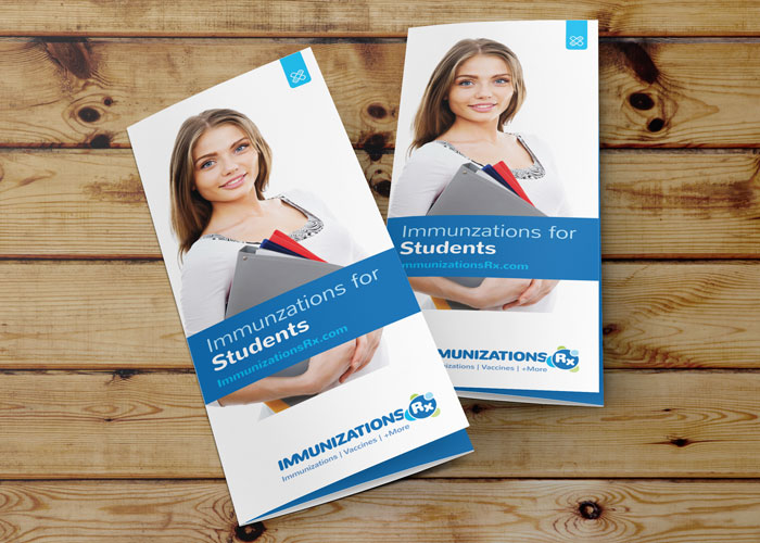
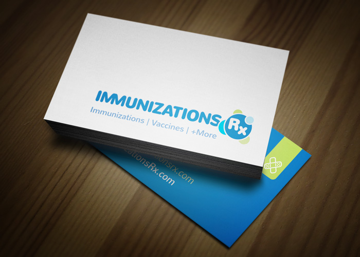
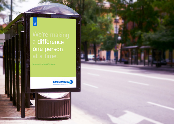
Immunizations RX
Branding & Identity
Completed as an intern at Nouvo Design, this projects goal was to create a brand that represented cleanliness, friendliness, and trustworthiness. The target audience had to cover a wide range from college students to seniors.
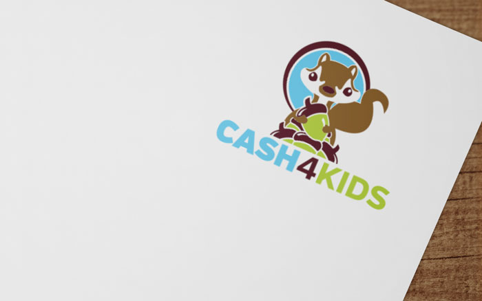
Cash 4 Kids
Branding & Identity
Cash 4 Kids is an online fundraiser for kids. The logo was designed to provide a fun and friendly sense to potential customers and fundraisers alike.
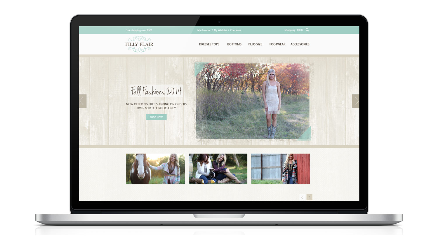
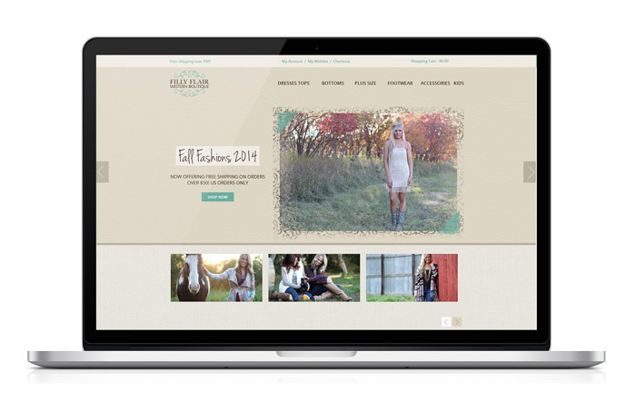
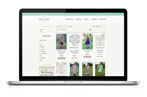
Filly Flair Online Boutique
Branding & Web Design
I had the privelege to work directly with the owner of Filly Flair to update her company's brand. I worked with her to determine what her brand represents and who it speaks to. The brand elements pay homage to the Filly Flair's country roots, while still bringing a clean and streamlined experience to the customer. I also helped carry this brand through spinoff company lines to maintain brand consistency.
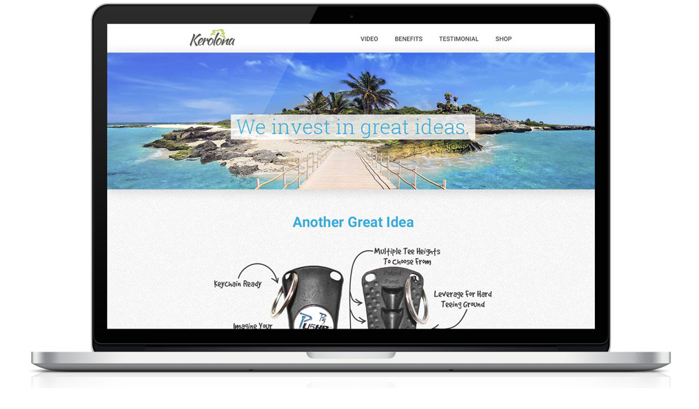
Kerolona
Web Design
An investment company, Kerolona needed an updated brand and website to launch their product. The goal of the project is to attract new inventors for the company to invest in, as well as sell the P5 pusher, their current investment. The brand is meant to be kept light and hint at a lifestyle that could be achieved if your project or product was invested in by Kerolona.
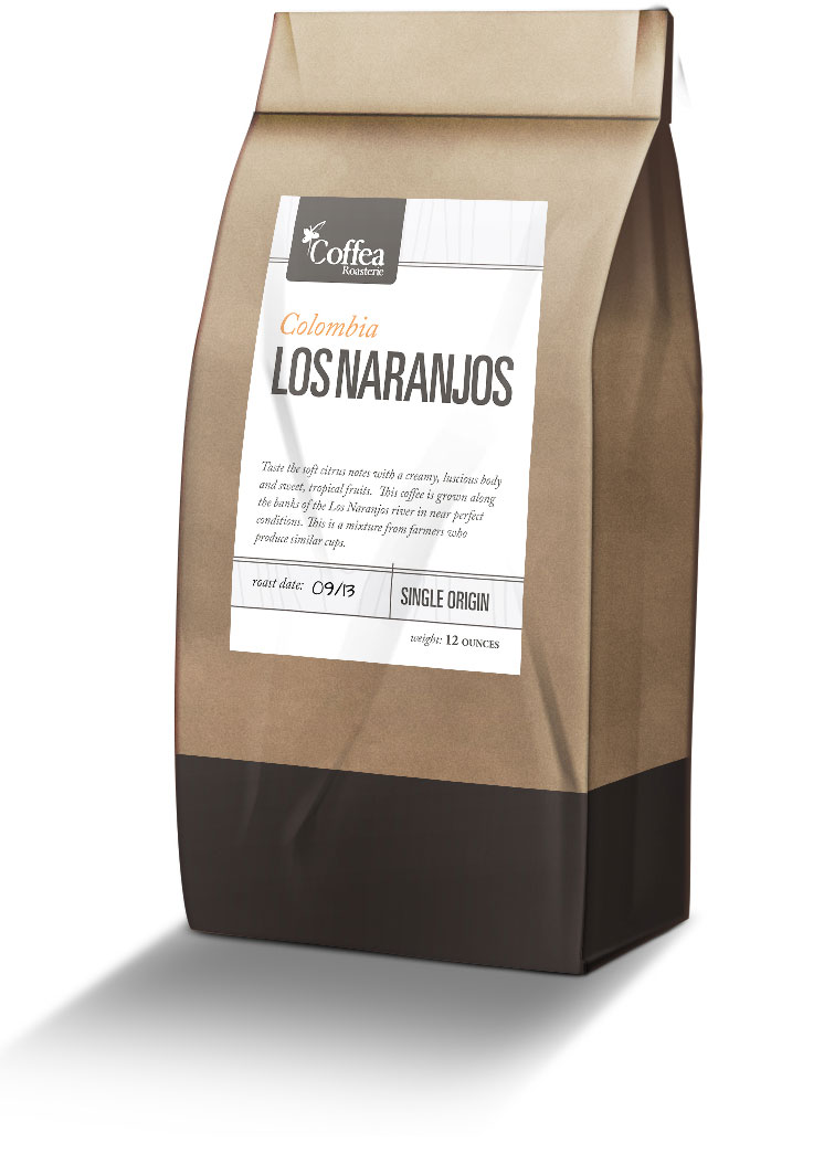
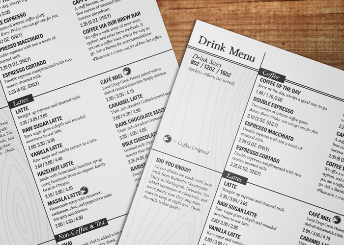
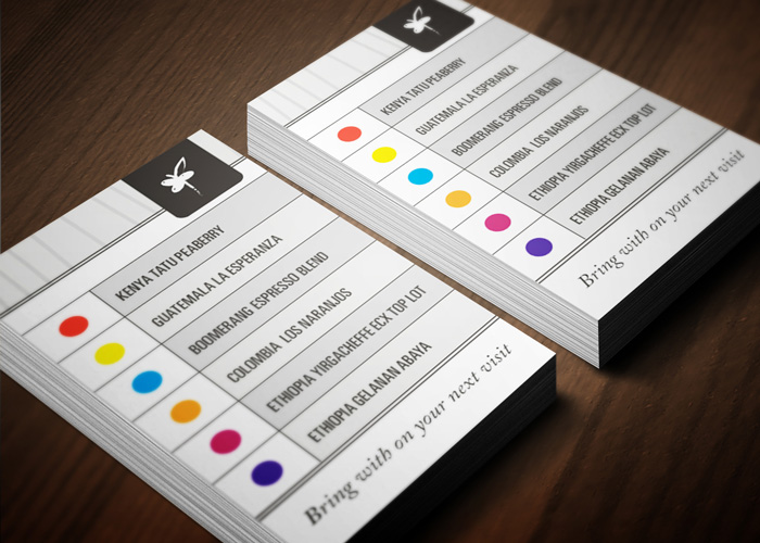
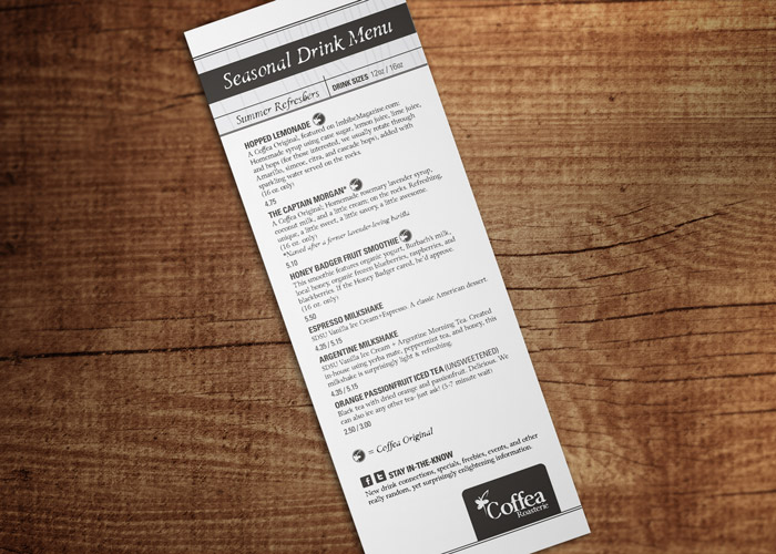
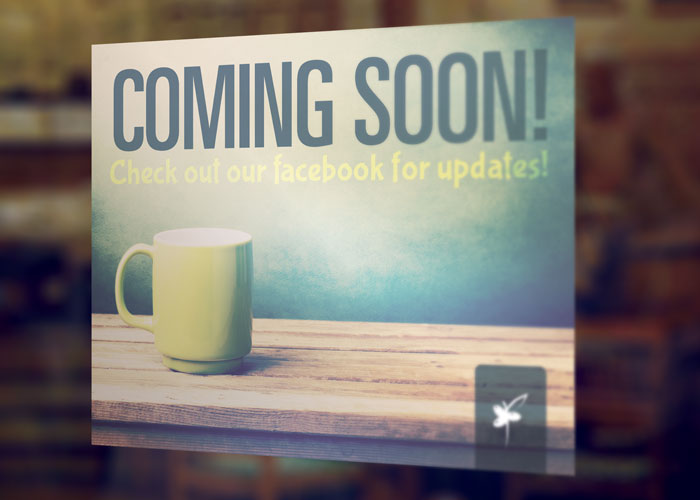
Coffea Roasterie
Packaging, Menu, & Promotional
This project included work on menus, labels, door signs, and coffee cards. The project goal was to create a simplistic and clean design with a feeling of warmth. The use of color was employed for easy identification for the repeat customer.
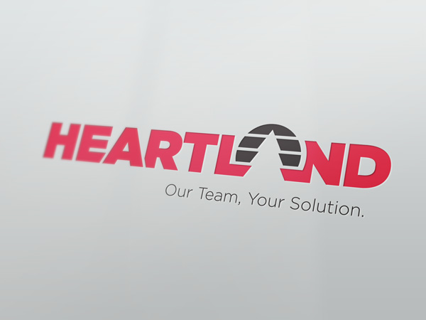
Heartland
Logo Design
This logo was completed during employment at Click Rain with creative direction from Mark Henderson. This logo was created with two things in mind: 1) Heartland is a family-owned company and should have some reflection of "home" and "warmth" to represent Heartland's commitment to service, and 2) The logo needs to be current to align with industry standards. The tree symbol placed where the "A" would be in "land" creates an abstract landscape that hints at Heartland's values, while the type and graphic elements use clean lines and geometric shapes to be "current".
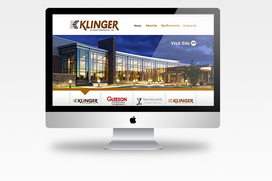
Klinger Companies
Web Portal Design
This project was completed during employment at Click Rain. The goal of this website is to provide one central web portal to access all sub-brands of Klinger Companies. The design was kept very simple and easy to navigate.
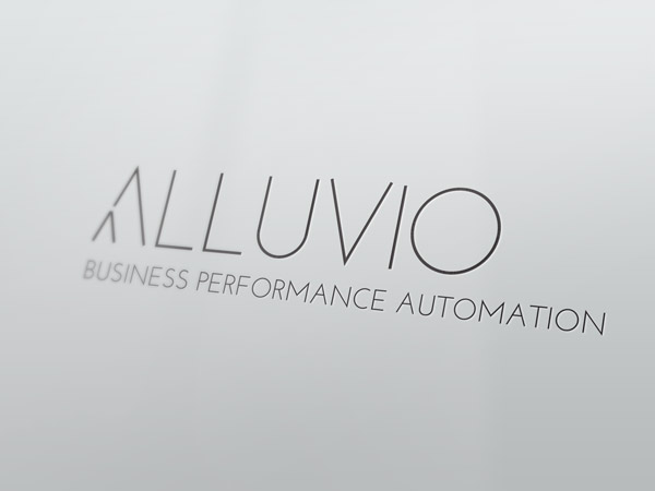
Alluvio
Logo Design
This logo design is inspired by two points of the brand. The first, is the name. Alluvio is derived from the term alluvial fan. An alluvial fan is a fan- or cone-shaped deposit of sediment crossed and built up by streams. This manifests itself in the the simplification and abstraction of the "A" being a symbol of an aerial view of an alluvial fan. The second point of symbolism of the brand comes from the services the company provides. They are an automation company that is rooted in systems and processes. The branch off of the "A" is also meant to reference an organizational tree chart. Overall, the chosen fonts and simplistic black and white, indicates a systematic and precise process.
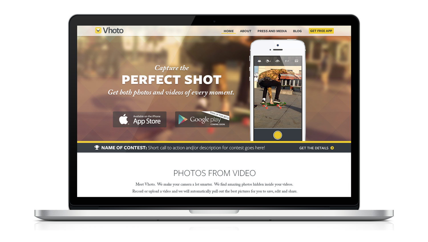
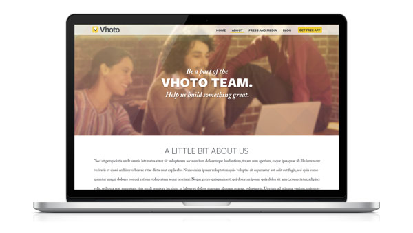
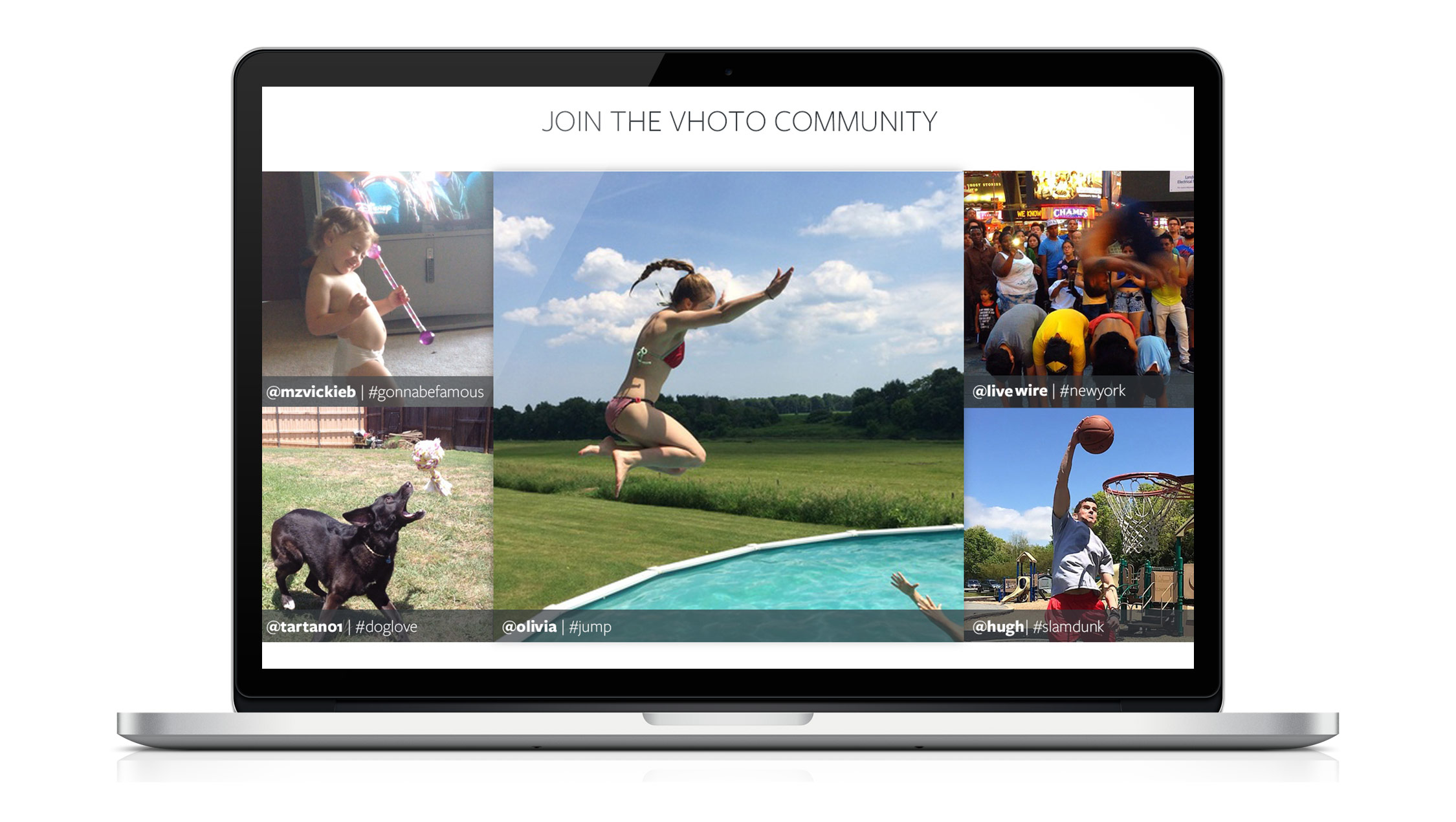
Vhoto
Web Design
Developed an updated and streamlined user experience for potential users. The design was created to entice the target audience with a fresh and vibrant brand. Worked directly with the Director of Marketing to assist in developing message, identity, and positioning.
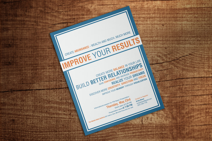
PSI Seminars: Basic
Promotional Flyer
This is a flyer done for PSI Seminars: PLD Team 24 for use to promote PSI Basic, a self-success course. The flyer was designed to attract professionals who want to improve their own sucess in all aspects of their life.
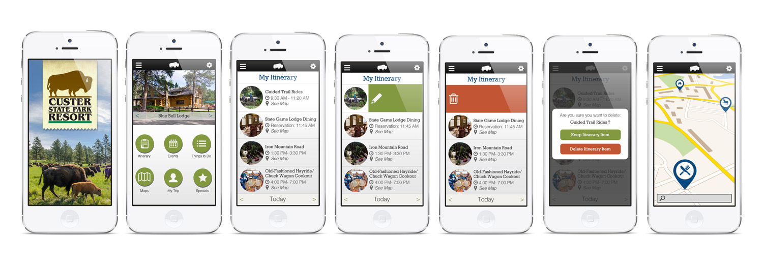
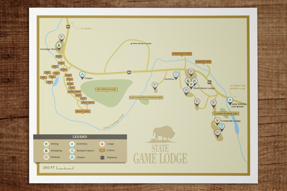
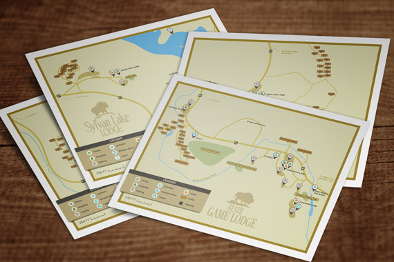
Custer State Park
Map & Mobile App Design
This project was completed during employment at Click Rain. The goal of the project was to create materials that assisted hotel guests to more easily navigate and plan their trips. This manifested as printable maps that assisted guests in navigating the four state parks, as well as, an app design that guests could download and use to plan their trips.
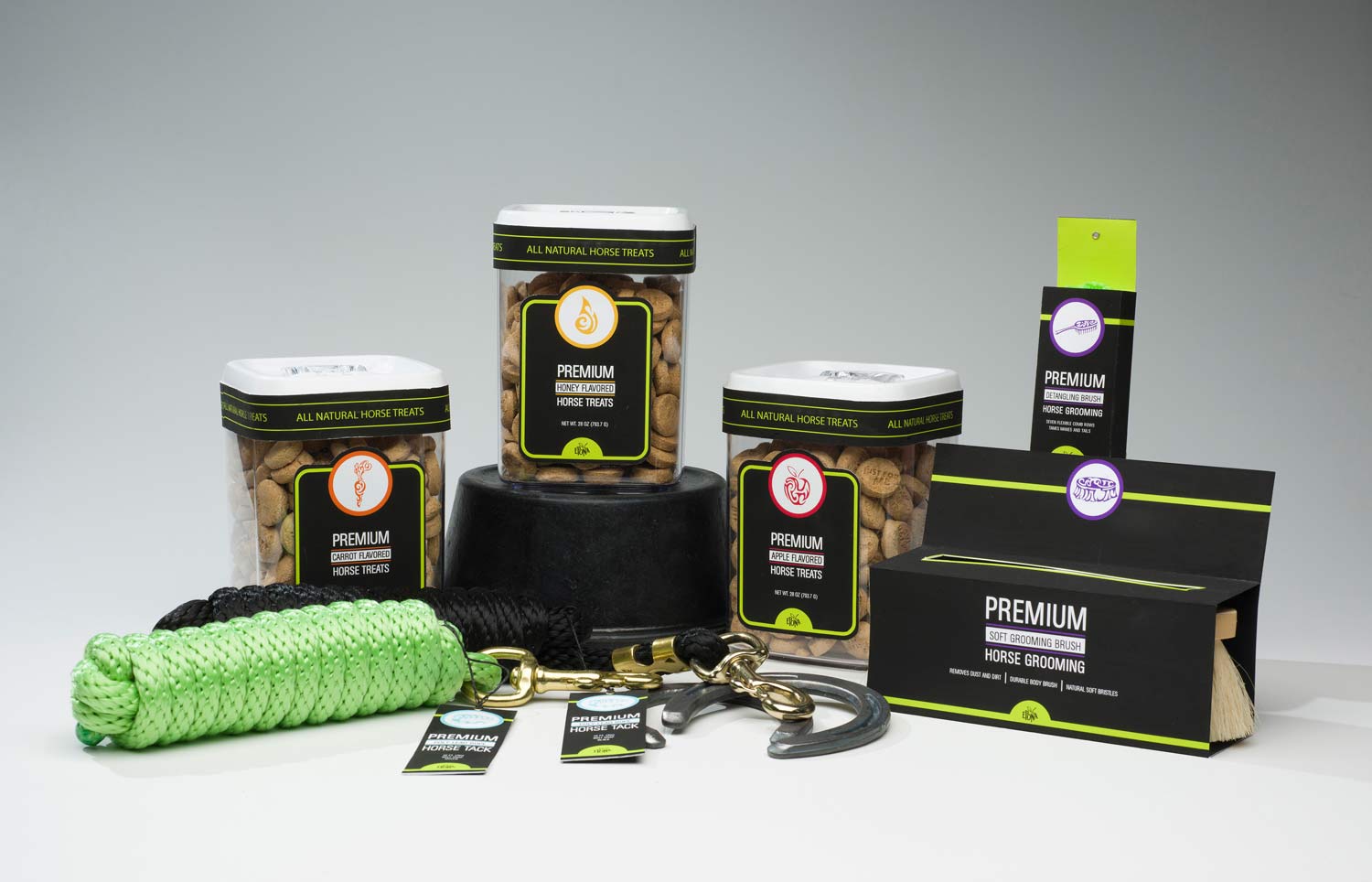
Epona
Identity & Package Design
Inspired by the Celtic goddess Epona, which means "divine mare", Epona is a horse product company that believes in providing quality products for the dedicated horse owner. The target audience would be married females, age 35-54, with kids between the ages of 12-17, and disposable income.
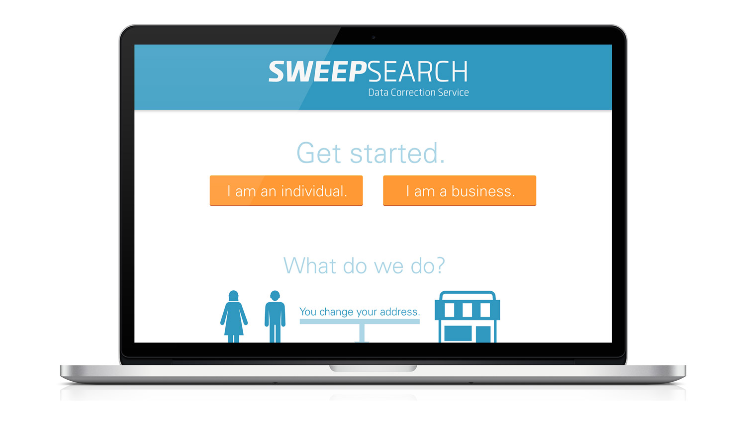
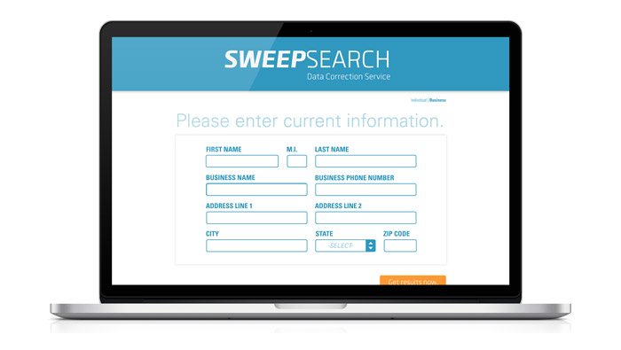
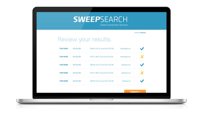
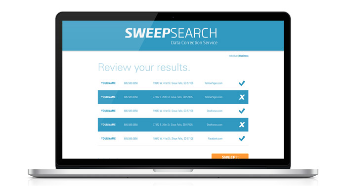
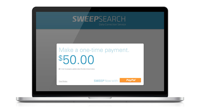
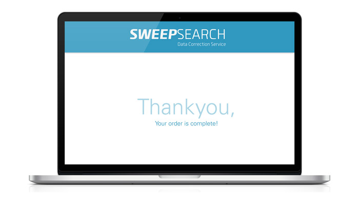
SweepSearch
Branding & Web Design
SweepSearch was created during Startup Weekend: Sioux Falls 2014. I was the sole designer on the team and was in charge of conceptualization of all branding & web design in a 54 hour period of time. The brand was created with trust and simplicity in mind.

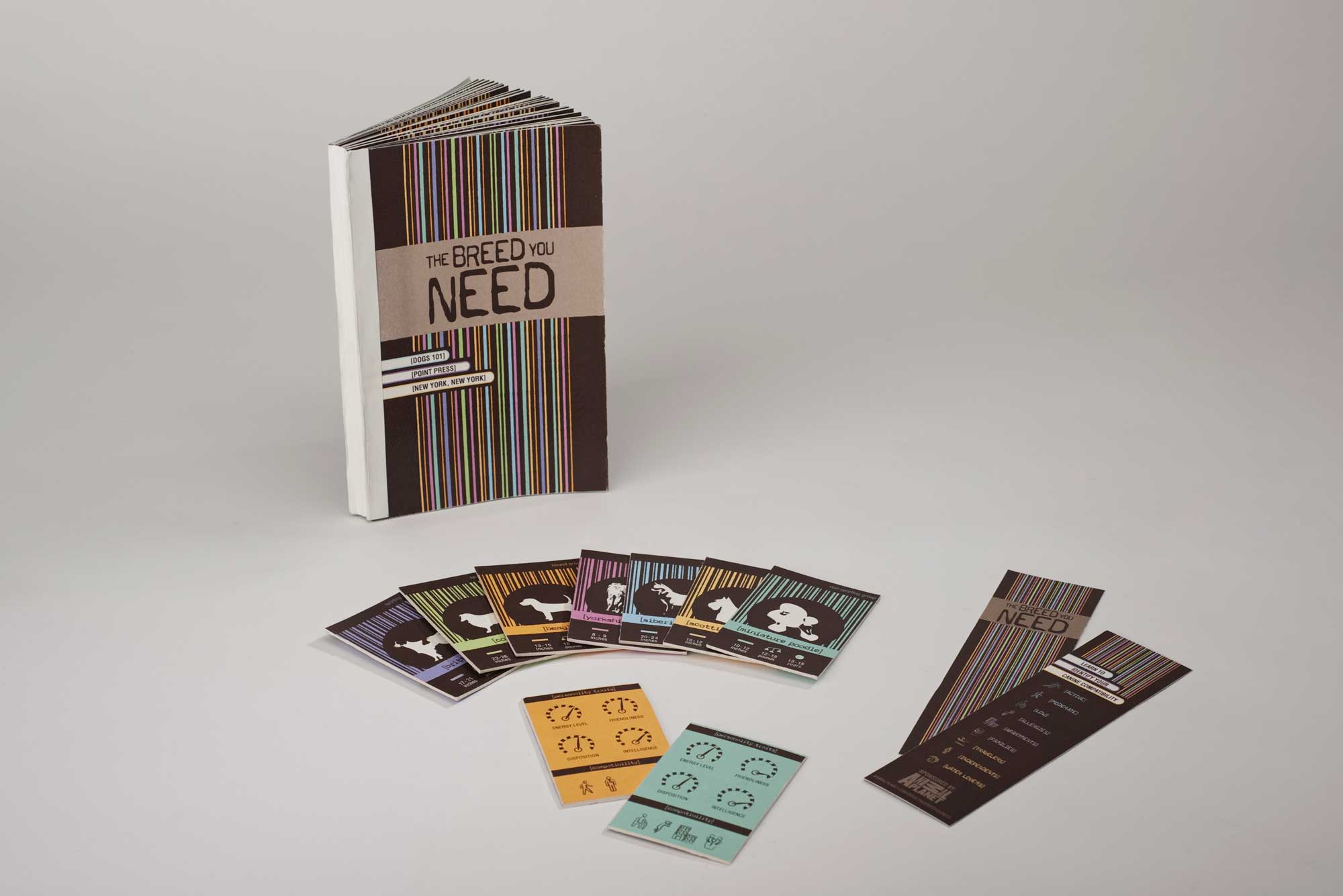
The Breed You Need
Information Design
This is an information design project about fitting dog breeds to an individual's lifestyle. This encourages lifelong relationships between the pet and owner. My primary target audience is the age group between 20-35.